Neo Brutalism in Modern Design: A Complete Guide for Bold, High-Contrast Interfaces

Neo brutalism is reshaping how designers create interfaces, landing pages, and brand experiences. Here’s what the style is, where it came from, and how to use it well.
Neo brutalism explained in 5 minutes
Neo brutalism is a contemporary architectural and design movement that has grown popular in web design and branding over the last few years. At its core, the UI style leans on high contrast and bold colors, thick borders and solid outlines, and hard, offset drop shadows instead of soft ones. It often folds in retro, deliberately “unpolished” touches drawn from 90s interfaces and pixel-art aesthetics.
It’s a modern evolution of 1950s–1970s brutalist architecture, now applied to digital design, landing pages, and product interfaces. The neobrutalist aesthetic stands apart from the polished, gradient-heavy SaaS interfaces that dominate the market.
What it looks like at a glance:
- Gumroad (2021+): bright accent colors, thick black outlines, flat card layouts.
- Figma marketing pages: illustration-heavy hero sections with bold geometric shapes and high-contrast color.
- Feastables: playful product blocks with oversized typography and vivid fills.
Why now? Neobrutalist sites load fast thanks to lightweight design (flat CSS, minimal imagery), and the raw look cuts through visual noise. Designers fatigued by uniform minimalism are reaching for neo brutalism for creative freedom and bold expression.
From brutalism to neo brutalism: origins and evolution
Traditional Brutalism is synonymous with béton brut, or raw concrete. Born in post-war Europe during the 1950s–70s, brutalist architecture focused on quick, functional public infrastructure. Le Corbusier and the Smithsons used exposed structure and massive form to make buildings honest about their materials. Both neo-brutalism and traditional Brutalism share that commitment to massive form and structural integrity.
In the mid-2000s to early 2010s, web designers brought the philosophy online. Early brutalist sites used plain HTML, minimal CSS, system fonts, and intentionally harsh layouts, think the Drudge Report or raw artist portfolios with almost no polish. Both styles put function ahead of ornament.
Neo brutalism updates that mid-century Brutalism with modern technology. Where brutalism reads raw and unfinished, neobrutalism combines it with colorful, structured, playful elements. It uses selective honesty, concealing the technology behind raw materials while keeping the interface usable.
Brutalism vs. neo brutalism:
- Color: brutalism is monochrome or severely limited; neo brutalism uses bright, saturated accents.
- Typography: brutalism leans on system fonts; neo brutalism uses bold type with intentional weight and hierarchy.
- Usability: brutalism often ignores UX conventions; neo brutalism preserves clear search, navigation, and structure.
- Mood: brutalism feels austere; neo brutalism feels energetic and playful.
Nostalgia for Windows 98 dialogs, early web banners, and default browser chrome feeds straight into today’s neobrutalist style.
Core visual characteristics: color, contrast, shapes, shadows
The visual language is built from a small set of elements used aggressively. Neobrutalism pairs saturated primaries, neon green (#39FF14), electric blue (#0066FF), hot pink (#FF69B4), against black or white, with flat fills and zero gradients.
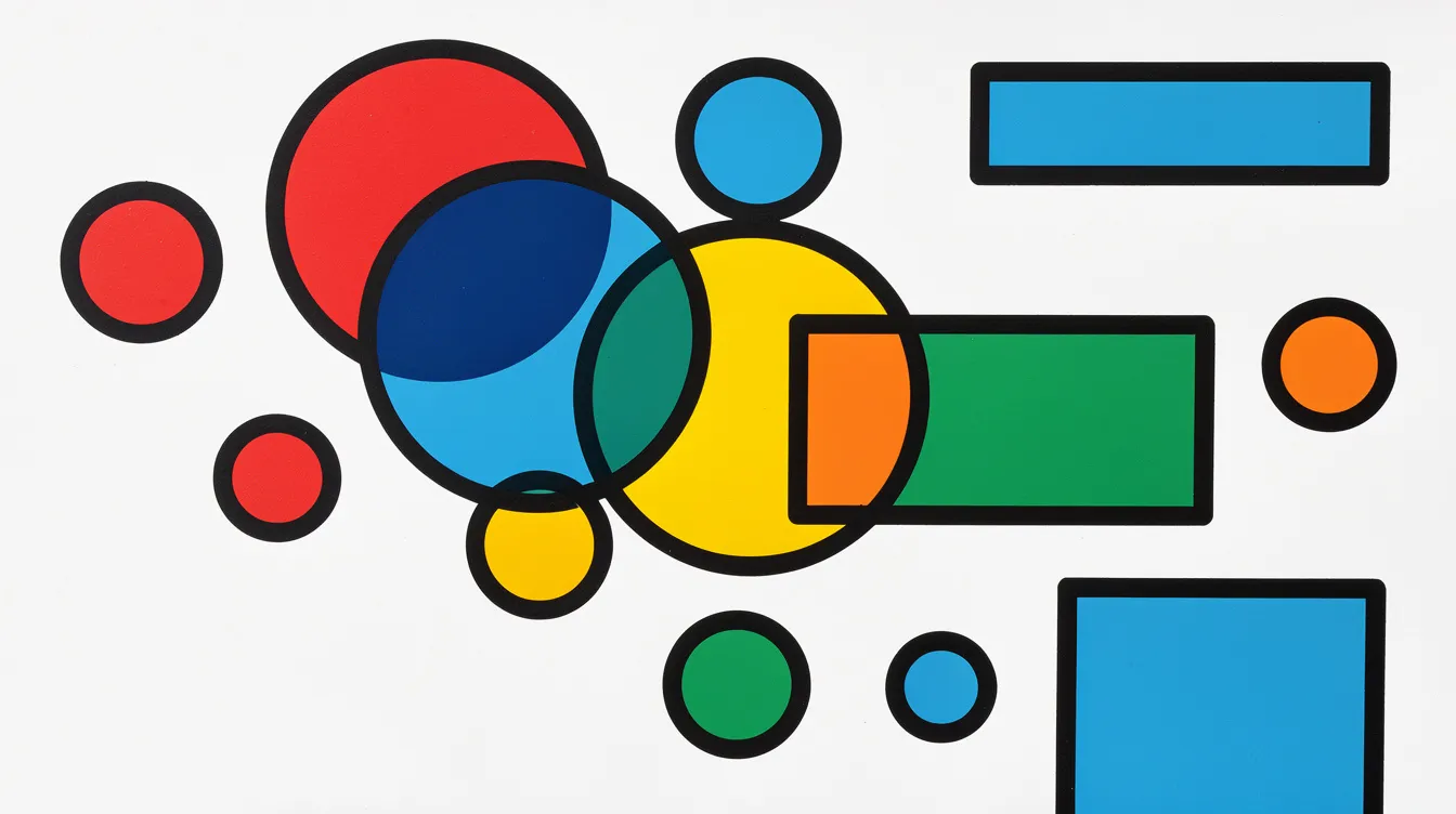
Bold geometric shapes define the layout. Big rectangles, circles, and angular panels feel like construction blocks stacked on the page, giving the style its graphic, poster-like energy. Sharp edges and solid lines reinforce the structural feel.
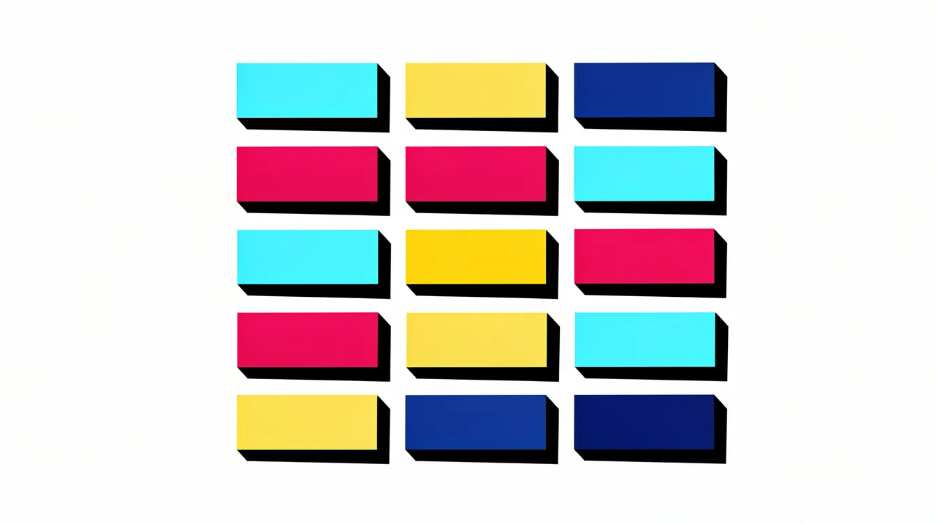
Drop shadows create depth through stark contrast rather than realism: typically offset 4–12px with zero blur, producing a sticker-like, cut-out effect in pure black. That’s what separates these stark shadows from the soft, ambient effects in other styles.
Thick borders (2–6px solid outlines) wrap cards, buttons, and images so every element feels like a distinct piece on the canvas, replacing the subtle dividers of minimalist UI.
In its architectural form, neo-brutalist buildings feature smoother finishes and warmer tones than traditional brutalism, materials like corten steel and high-performance glass, warm interior surfaces, extensive glazing, and energy-efficient, eco-friendly construction.
Typography and layout
Neobrutalism uses oversized, expressive typography as a primary tool for hierarchy. Headings usually run 700–900 weight at 2–3× the body size, creating a clear focal point on every screen. Monospace fonts and quirky grotesks are common for display.
Font pairings for a neo brutalist landing page:
- Display: Space Grotesk, Satoshi, or Space Mono.
- Body: Inter, Roboto, or IBM Plex Sans.
Pair bold headlines with clean, neutral body fonts to keep long-form content legible. Hold body text to 60–80 characters per line with generous line spacing to offset the visual weight of thick borders.
Layout is grid-based but deliberately imperfect, elements may break the grid, overlap, or sit slightly misaligned for intentional tension. Despite the raw look, keep 24–32px margins so components have room to breathe and pages stay scannable.
Hierarchy guidelines:
- Headings: 36–48px for H1, 24–32px for H2.
- Body: 16–18px.
- Consistent alignment for primary buttons and clear calls to action.
- An 8px spacing scale to keep the raw look intentional.
Neo brutalism vs. other modern styles
vs. classic brutalism: classic brutalism uses monochrome palettes, unstyled elements, and often sacrifices usability. Neo-brutalism blends that raw aesthetic with polish, adding color, hierarchy, and structure, contrasting traditional aesthetics with contemporary expectations.
vs. minimalism: minimalism chases simplicity; neobrutalism chases boldness. Where minimalism retreats into negative space and muted tones, neo brutalism fills the canvas with hard shadows, thick borders, and striking color contrast.
vs. neumorphism: neumorphism relies on soft inner shadows and subtle depth, and often fails accessibility due to low contrast. Neo brutalism’s high contrast and visible controls make interactive elements far easier to recognize.
vs. glassmorphism: glassmorphism aims for translucent elegance; neo brutalism aims for flat, graphic, poster-like impact. One whispers, the other shouts.
Neo-brutalism favors artistic expression, which makes it ideal for brands that want their personality to come through immediately, with visual impact calmer approaches can’t match.
Accessibility, contrast, and usability
High contrast is the point, but it still has to meet WCAG 2.2. Keep a contrast ratio of at least 4.5:1 for body text and 3:1 for large text and UI elements. Research shows roughly 40.9% of foreground/background color pairs across popular sites fail WCAG AA, so test deliberately rather than assuming bright equals readable.
Color pairs to avoid:
- Neon yellow (#FFFF00) on white → fails contrast badly.
- Cyan on bright green → nearly invisible for color-blind users.
Accessible alternatives:
- Yellow on near-black (#1A1A00) → contrast ratio ~18:1.
- Cyan on deep navy (#001F3F) → strong readability.
Use WebAIM’s contrast checker during handoff, and run automated accessibility checks and color-blind simulations before launch.
Readability checklist:
- Avoid decorative fonts for body text; use readable typefaces.
- Keep line length at 60–80 characters.
- Use 1.5–1.75× line spacing to offset heavy borders.
- Test interactive elements for recognizability on hover and focus.
- Make button shapes and outlines clearly communicate clickability, even inside a heavily bordered layout.
These principles apply on desktop and on smaller mobile screens alike.
Designing with neo brutalism: practical UI guidelines
Step 1 — Color palette. Use 2–3 bold colors plus black and white for structure. Test every accent against its background for contrast before committing, and limit where accents appear so they don’t overwhelm.
Step 2 — Borders and shadows. Apply thick borders consistently: 3–4px for primary components, 2px for secondary. Use drop shadows at 6–8px offset with zero blur. Document them as CSS tokens:
border: 3px solid #000box-shadow: 6px 6px 0px #000border-radius: 0
Step 3 — Spacing. Use an 8px scale. Cards get 24–32px padding; sections get 48–64px vertical margins, so elements breathe despite their visual weight.
Step 4 — Geometric illustration. Use simple shapes as decoration: flat circles, squares, and thick lines for icons, charts, or accent blocks. Skip complex 3D artwork.
Step 5 — Interactive states. Shift a button’s shadow on hover (say, from 6px to 2px offset) to simulate a “press” while keeping the neobrutalist look.
Neo-brutalism, in architecture, leans toward bespoke residential and high-end commercial work, and the same bespoke thinking fits digital design: every component should feel intentionally crafted, not templated.
For a pricing card: 3px black border, 24px padding, 6px hard shadow, and one vivid accent color for the CTA button.
Real-world examples and use cases
Gumroad uses neobrutalism, bold colors and thick outlines, across its marketing and product pages. The layout is simple and scannable, relying on flat card blocks with hard shadows for impact.
Feastables runs bright colors and big type in playful product blocks that grab attention instantly. Figma’s brand refresh shows the principles at work through illustration-heavy sections with high contrast and strong hierarchy.
Halo Lab’s “Look Beyond Limits” pushes display type to extreme sizes for drama. The style is popular for portfolios and creative agencies, where independent makers use thick borders, hand-drawn icons, and raw type to signal creative freedom.
Because it builds a strong, striking brand identity, most adoption happens on marketing pages, campaign microsites, hero sections, and onboarding, rather than dense data dashboards. It works best where memorable, high-impact experiences matter most.
When neo brutalism is the right choice (and when it isn’t)
It works best for early-stage startups, creative tools, design-led brands, and campaigns where standing out matters, especially for audiences that value bold visuals and personality.
But bold visuals can overwhelm if overused, and the style can feel too aggressive for elegant brands. Financial dashboards, medical interfaces, and products for broad or sensitive audiences usually need calmer, more familiar treatments, the cognitive load of heavy borders and bright color on every screen adds up.
Partial adoption: use neo brutalist panels, hero sections, or illustrations on marketing pages while keeping core workflows closer to minimalism. You capture attention where it counts without raising cognitive load in dense flows.
Decision checklist:
- Does your audience expect boldness or calm?
- Is the information density low enough to handle heavy visual treatment?
- Do your accessibility standards still hold with this palette?
- Does the brand’s personality align with raw, graphic energy?
Success comes down to matching the style to context. Try it on a single landing page before rolling it out across a whole product.
Summary and implementation checklist
Neo brutalism draws on mid-century brutalist architecture and applies it to modern UI/UX and graphic design, defined by high contrast, bright colors, bold geometric shapes, oversized typography, and stark drop shadows.
Quick-start checklist
- ☐ Set palette: 2–3 vivid accents + black + white
- ☐ Choose fonts: bold display + clean body
- ☐ Define borders: 3–4px solid, radius 0
- ☐ Set shadows: 6–8px offset, 0 blur
- ☐ Test all contrast ratios (4.5:1 minimum for text)
- ☐ Verify hover/focus states on every interactive element
- ☐ Document tokens in a reusable neo brutalist style guide
Start small. Apply the style to one landing page or marketing banner, measure how your audience responds, and iterate from there.
Want a bold, on-brand site that still converts?
Neo brutalist or minimal, custom-built in React & Next.js, fast, accessible, and designed around your goals. Tell me what you’re building.
Related Articles
Brutalism & Anti-Design Web Trends
Where the raw, anti-polish web movement came from and how to use it without breaking UX.

Contrast & Balance in UI Design
How to wield contrast for hierarchy and impact without wrecking readability.