CSS Is Eating JavaScript's Lunch
And most developers haven't noticed yet.
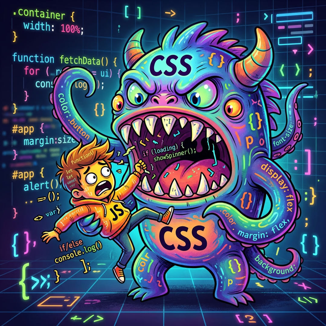
For the last decade, JavaScript has been the answer to everything. Want an animation? JavaScript. Want to detect when an element enters the viewport? JavaScript. Want to style a parent element based on what's inside it? Sorry, can't do that, write some JavaScript.
That era is ending.
CSS in 2026 is not the CSS you learned five years ago. The browser has quietly shipped feature after feature that used to require a library, a package, a build step, and 47 dependencies. And most people are still reaching for npm install out of habit.
Let's talk about what's actually here, what it replaces, and why you should care.
Scroll-Driven Animations
Remember Intersection Observer? You'd set up an observer, listen for when elements crossed a threshold, toggle a class, write the corresponding CSS, and then debug why it fired twice. Every. Single. Time.
Scroll-driven animations make that whole pattern obsolete.
@keyframes fade-in {
  from { opacity: 0; transform: translateY(24px); }
  to   { opacity: 1; transform: translateY(0); }
}

.card {
  animation: fade-in linear both;
  animation-timeline: view();
  animation-range: entry 0% entry 40%;
}
That's it. No JavaScript. No observer. No class toggling. The browser handles it natively, on the compositor thread, which means it's smoother than anything you were doing with JS anyway.
animation-timeline: scroll() ties an animation to the page scroll position. animation-timeline: view() ties it to when an element enters the viewport. animation-range lets you control exactly which part of the scroll triggers which part of the animation.
You can build the entire "elements fade in as you scroll" pattern that's on literally every marketing site, the one people install Framer Motion for, in pure CSS.
Shippable today?
Chrome and Edge: since 2023. Firefox: 2024. Safari: in preview. For most projects with a Safari fallback (graceful: elements just appear instantly), this is a ship-it-today feature.
@starting-style
This one is small but it's been a long time coming.
Animating elements in has always been awkward. You can animate something from one state to another once it's in the DOM. But the moment it's added, that first render frame, the browser doesn't know what to transition from. So nothing animates. Developers have hacked around this forever: add the element, then add a class on the next frame, then animate. It's a mess.
@starting-style fixes it.
dialog {
  opacity: 1;
  transform: scale(1);
  transition: opacity 0.3s, transform 0.3s;
}

@starting-style {
  dialog {
    opacity: 0;
    transform: scale(0.95);
  }
}
Now when the <dialog> enters the DOM, the browser knows where to start the transition. It fades and scales in automatically. No JavaScript, no setTimeout hack, no requestAnimationFrame gymnastics.
Combine this with display: none transitions (also newly possible) and you can build fully animated show/hide interactions, modals, drawers, tooltips, without touching JS at all.
:has()
This is the big one. The one people said would never be possible in CSS.
:has() is a parent selector. It lets you style an element based on what's inside it, or what comes after it. This was the fundamental limitation of CSS selectors for 20 years. JavaScript filled the gap.
/* Style a card differently when it contains an image */
.card:has(img) {
  padding: 0;
}

/* Style a label when its input is checked */
.field:has(input:checked) {
  background: #f0fdf4;
  border-color: green;
}

/* Style a section when it has no children */
.list:not(:has(*)) {
  display: none;
}
Think about how much conditional styling logic you've written in JavaScript just because CSS couldn't select upward through the DOM. State management for UI patterns, checked, focused, filled, empty, most of that can now live in CSS where it belongs.
:has() also works as a general conditional. You can write things like "if any input in this form is invalid, style the submit button differently." That's not a hack. That's just how it works now.
Browser support
Every major browser. Fully supported. No fallback story to write. Use it.
What This Actually Means
Here's the honest take: a lot of the JavaScript you're writing for UI interactions is technical debt you're accumulating for no reason.
Not all of it. JavaScript still owns real interactivity, data fetching, state, user input handling, anything that requires logic. That's not going anywhere.
But the layer between "the design" and "the behavior", the stuff that makes things move, appear, respond, and feel alive, CSS is claiming that territory back. The browser vendors have clearly decided that the answer to "I can't do this in CSS" should eventually become "yes you can."
The developers winning right now are the ones who know both sides deeply. They're not picking a side, they're just using the right tool. And increasingly, the right tool for animation, transitions, and responsive state is CSS.
The Practical Takeaway
Three swaps to make this week
- Scroll animations. Before reaching for a scroll-animation library, check if
animation-timeline: view()covers your use case. It probably does. - Mount transitions. Before writing JavaScript to add a class on element mount for a fade-in, use
@starting-styleinstead. - Conditional styles. Before writing a JS function that toggles a parent class based on a child's state, try
:has()first.
You'll ship less JavaScript, get better performance, and write code that's genuinely easier to maintain. That's the whole game.
CSS caught up. Most people just haven't adjusted yet.
Start your project
Related Articles

Minimal, Fast, and Sustainable UX
Leaner layouts and fewer heavy scripts create calmer, faster, more sustainable experiences.

Building Data-Driven Design Systems for Scale
How to create and maintain scalable design systems that evolve with your product needs.
Need a Front End That Ships Less JavaScript?
I build modern web apps that lean on the platform first, fast, accessible, and easy to maintain. Let's talk.